Space Saving · Bold Contemporary
Charcoal Bold Wall bed with a media wall Space Saving Design
High contrast, confident mass, a single saturated move per room. Dark joinery held against light stone. Small homes do not need smaller furniture. They need fewer objects doing more jobs, and every vertical millimetre used.
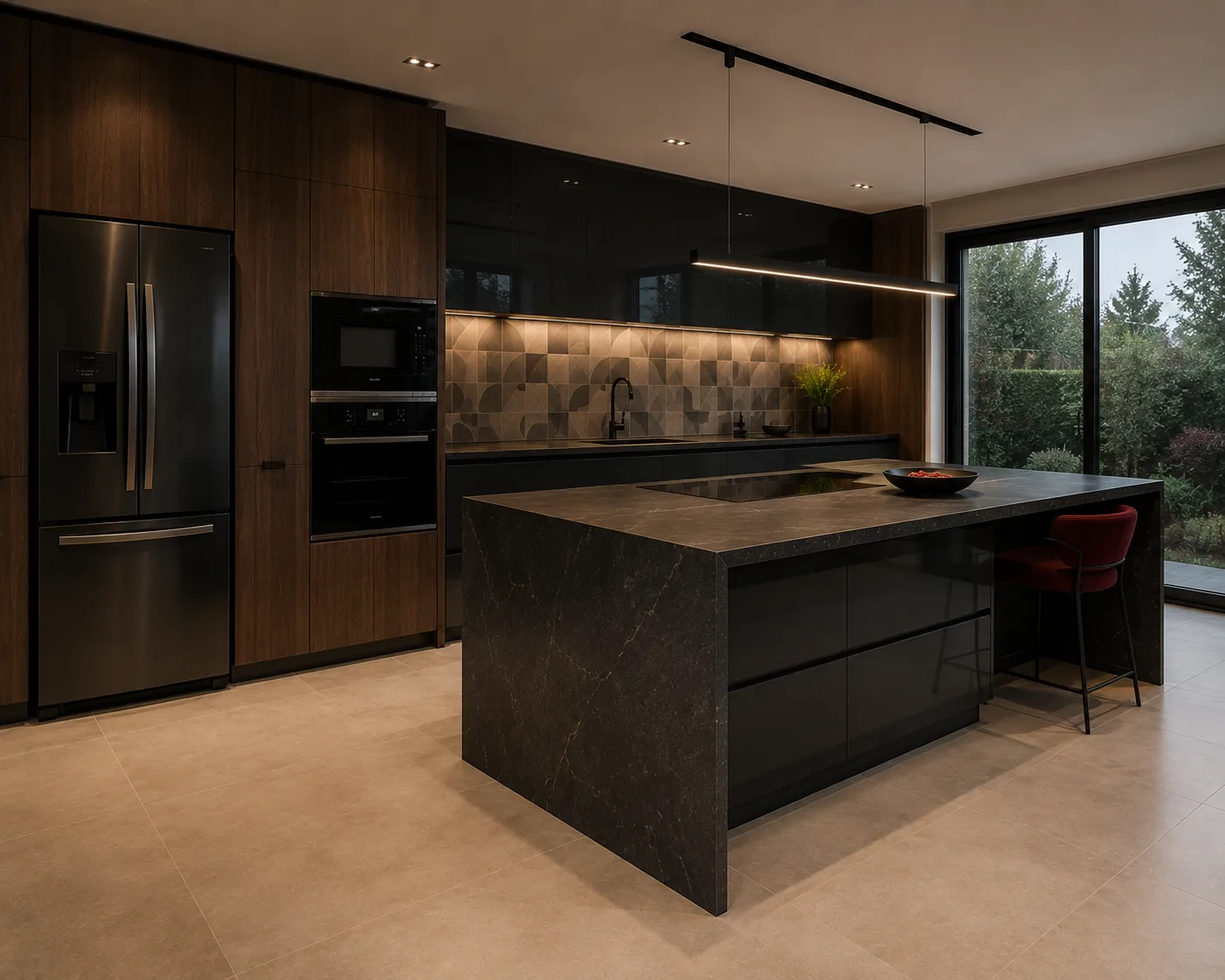
Specification
Space Saving design details
| Detail | Specification |
|---|---|
| Layout | Wall bed with a media wall |
| Style | Bold Contemporary |
| Palette | Charcoal · Oxblood · Smoked Oak |
| Primary move | A wall bed folding into a media wall |
| Secondary move | Deep drawers in the bed base |
| Finish | Charcoal with a black reveal |
| Hardware | Gas struts and a locking frame |
| Home size | Room dimension |
|---|---|
| 1 BHK | Studio / 1 BHK, 350-500 sq ft |
| 2 BHK | 2 BHK, 600-800 sq ft |
| 3 BHK | 3 BHK, 900-1,200 sq ft |
| 4 BHK | 4 BHK, 1,400-1,800 sq ft |
| 4+ BHK / Villa | Villa, 2,000 sq ft plus |
Storage features
- Linen storage inside the wall-bed unit
- A media wall with concealed bays
- A fold-down desk
Special features
- A bed that becomes a media wall in ten seconds
- Dark joinery hiding the mechanism
- Genuinely two rooms in one footprint
Ideal forHomes where one room must be a bedroom and a living room
Compare
The same space saving in the other five styles
One brief, six resolutions. Each carries its own layout, material specification and storage strategy.

Minimal Wall-hung everything Space Saving
Chalk · Pale Oak · Linen
See this design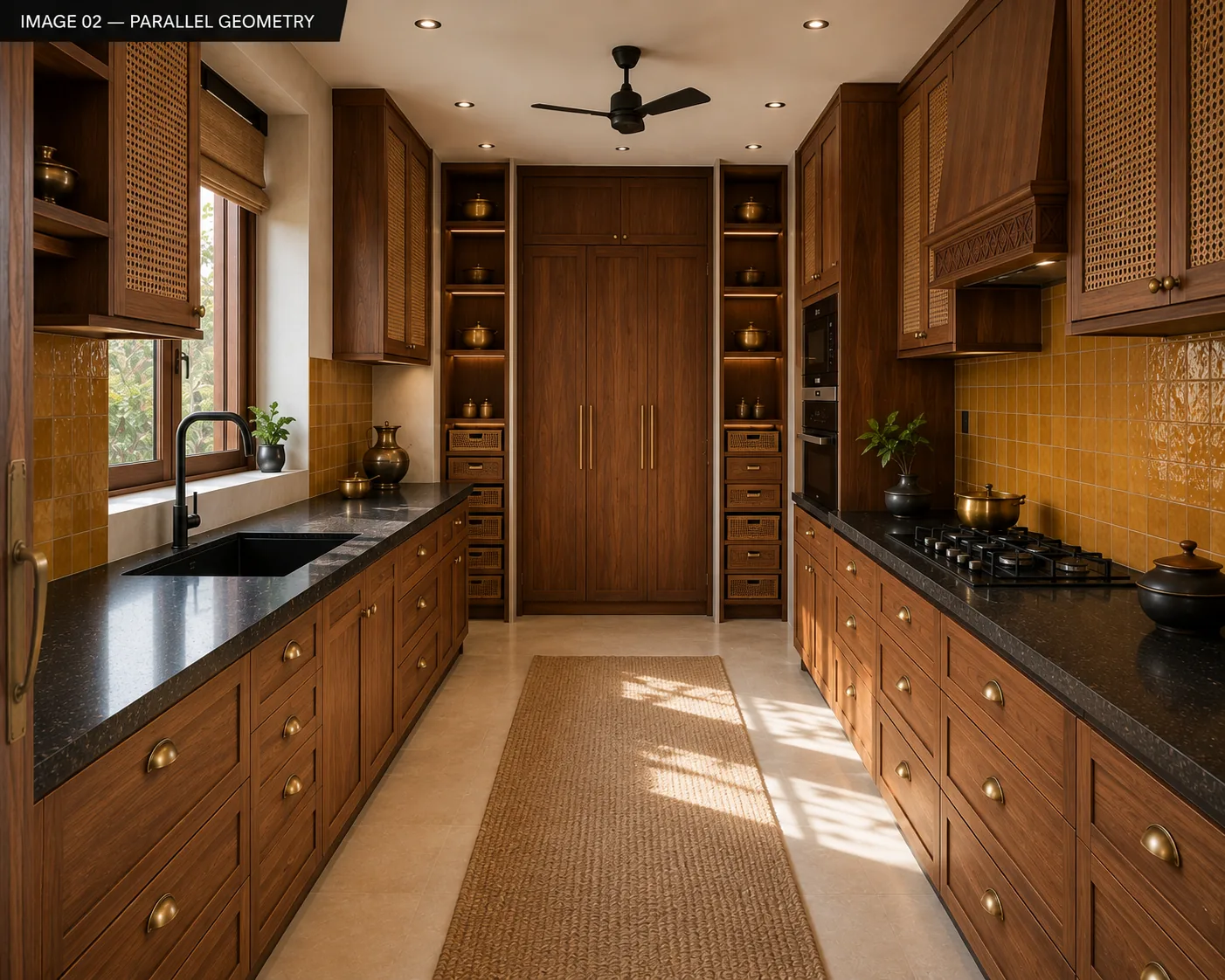
Heritage Teak folding partition Space Saving
Teak · Cane · Antique Brass
See this design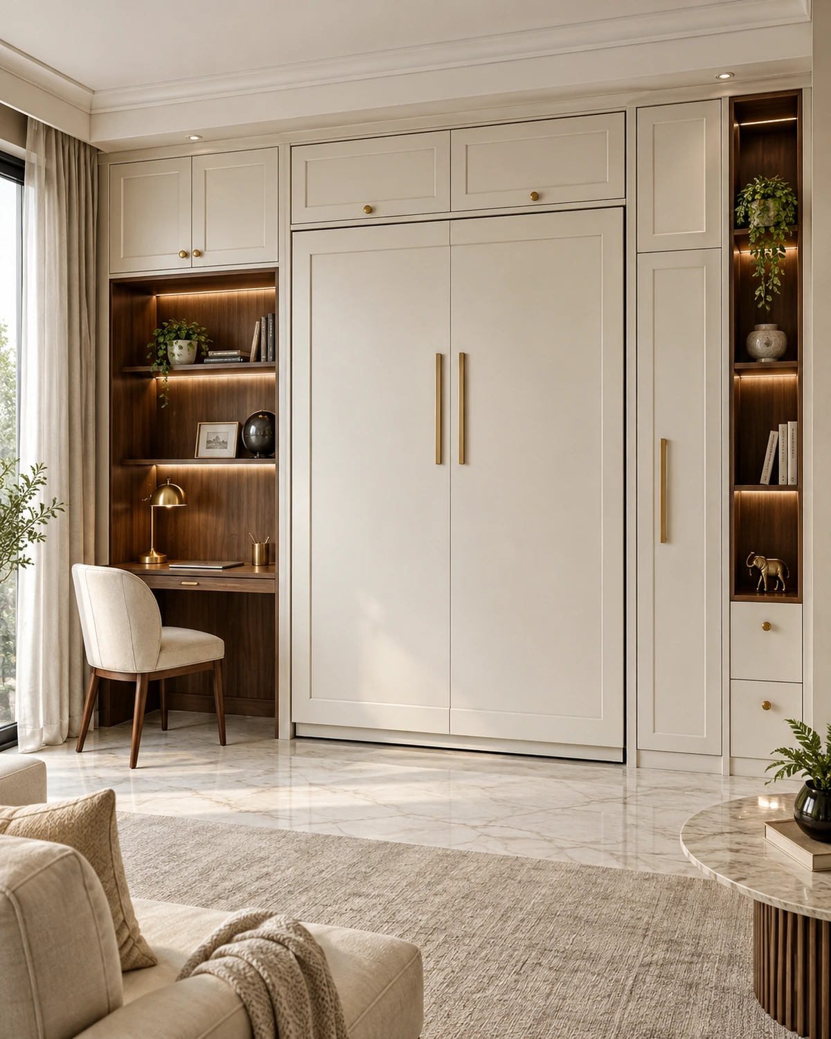
Classic Built-in banquette with storage Space Saving
Ivory · Statuario · Gold
See this design
Scandi Loft bed with a study under Space Saving
Birch · Chalk · Sage
See this design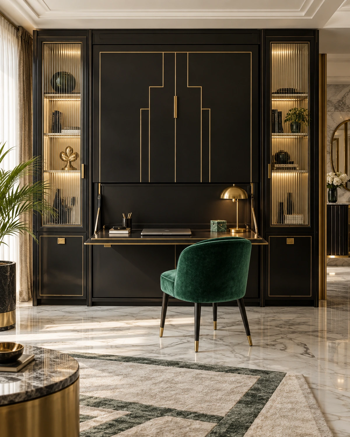
Deco Fluted multi-use island Space Saving
Emerald · Brass · Lacquer
See this designDetail
Specifying and living with this space saving
High contrast, confident mass, a single saturated move per room. Dark joinery held against light stone. That governs every material decision on this page — the layout and the storage strategy come first, and space saving is where the bold contemporary palette gets applied to a plan that already works.
A specification is only as good as what happens after handover. space saving in this style is chosen as much for how it ages as for how it photographs on day one — the joinery finish, the hardware grade and the way an edge is sealed all show up in year three, long after the render is forgotten.
Bold Contemporary is a coherent palette rather than a fixed rule, and most finished homes borrow across two styles rather than committing to one throughout. What rarely works is switching the palette room to room within one sightline — the transition needs a threshold, a change of material, or a corridor to read as intentional rather than accidental.
The specification below is what we issue to the factory and the site for this exact style and layout. It is also what a warranty is enforced against, which is why it is written as grades and dimensions rather than as adjectives.
Nothing on this page is a fixed catalogue item. The layout, the palette and every material line are redrawn against your own room dimensions before anything is priced — what you see here is the starting specification, not the finished drawing.
Bold Contemporary suits a household that already knows roughly what it wants a space saving to feel like, rather than one still deciding between opposites — the palette is distinctive enough that it rewards commitment and looks unresolved applied half-heartedly.
This reads best in a home where at least the adjoining rooms share the same direction, even if not the same materials. Bold Contemporary carried into one room and abandoned at the next doorway tends to make both rooms look like an afterthought rather than a choice.
If you are drawn to bold contemporary but unsure it will hold up to daily use, that is worth raising directly at the survey — the palette can usually be adapted toward more forgiving materials without losing the character that made it appealing in the first place.
Worth checking before sign-off
- Measure what you own before deciding the internal layout. Hanging length, folded stacks and bag storage are three different problems and most wardrobes solve only the first.
- Floor-to-ceiling almost always beats a wardrobe with a loft above it. The gap on top collects dust and stores nothing you can reach.
- For sliding shutters, remember you can only ever open half the wardrobe. In a small bedroom that is a fair trade; in a dressing area it is not.
- Check the wall before the design. Wardrobes against an external or bathroom-adjacent wall need a ventilated gap or the back panel will grow mould.
- Insist on soft-close on every drawer and door. It is the difference between joinery that stays aligned and joinery that loosens.
- Plan the mirror position with the room's light, not the wardrobe elevation. A mirror facing a window is a glare source, not a dressing mirror.
Living with it
- Leave the doors open for an hour after the monsoon starts and once a month through it. Trapped humid air is what makes a wardrobe smell.
- Vacuum the sliding track quarterly. Grit in the track is the reason sliders get heavy and eventually jump.
- Tighten hinge screws at the end of the first year.
- Keep silica or camphor in the folded-stack section in coastal cities.
Mistakes worth avoiding
- Designing all shelves and no drawers, which produces storage that gets stacked and never re-sorted.
- Putting a wardrobe hard against a damp external wall with no ventilation gap.
- Sliding doors in a room too small for the shutter widths — the usable opening becomes narrower than the clothes.
- Forgetting the loft ladder or the loft access entirely.
Where this style tends to cost more than a plainer one is in the detailing rather than the base material: shutter finish and any profiling on the front. and internal accessories: pull-downs, trays, racks and lighting add up quickly. are worth pricing explicitly before you compare quotes across studios. Sliding hardware, which costs several times a hinge system.
Detailing
Finer points of this space saving
A 4″ plinth recess lets you stand close without stubbing your toes, and hides the floor level tolerance at the same time.
Sensor lighting on the hanging rail is the single upgrade people notice daily.
Where the wardrobe meets the ceiling, a shadow gap absorbs the ceiling’s unevenness far more gracefully than a scribed filler.
Keep the handle line continuous across the elevation; a broken handle line makes an otherwise clean run look busy.
Questions
Space Saving in Bold Contemporary — answered
Sliding or hinged for a space Saving?
Hinged if the room can spare 24″ of swing, because you see the whole interior at once and it costs less. Sliding where the bed is close to the wardrobe, accepting that half the run is always covered.
How deep should it be?
24″ internally for hanging clothes on a standard rail. Below 21-1/2″, shirts touch the back and the doors rub, which is the most common fault in a badly measured wardrobe.
How do I stop clothes smelling damp?
Ventilate. A 3/8″ rear gap, plinth vents and doors left open for an hour a month through the monsoon will do more than any product.
Can a space Saving be built around an existing bed layout?
Yes — the wardrobe follows the room. What has to be checked first is the door swing, the fan sweep and the switchboard positions, which are the three things that force redesign late.
What internal accessories are actually worth it?
Soft-close drawers, a pull-down rail where the run is above 2.1m, and sensor lighting. Most other accessories look useful in a showroom and are used twice at home.
Questions
Space Saving questions
What is the single most effective space-saving move?
Going vertical. Loft cabinets above doors and full-height wardrobes add storage that costs almost nothing in floor area, and they are what stops clutter reaching the floor.
Are wall beds reliable?
A good gas-strut mechanism rated for 20,000 cycles is. The failure point is fixing — it must be bolted into structure, never into plasterboard alone.
Does light-coloured joinery really make a room look bigger?
Matching joinery to the wall colour does. The effect comes from removing the visual edge between storage and wall, not from lightness itself.
How do I fit dining into a small living room?
A banquette against a wall, or a drop-leaf table fixed to the island. Both seat more people in less floor area than a freestanding table with chairs on all sides.
Next step
Build this space saving.
Send the floor plan and the room dimensions. We come back with this design adapted to your space and priced line by line.